ATOMIC

BOMB

A Front-end productivity booster for React, React Native and NextJS (and soon a Rust version with Yew.rs) based upon the Atomic Design principles envisioned by Brad Frost.

The tool provides a CLI that creates boilerplate code for individual front-end components.

By following the guidelines, these components can be easily customized and reused across different projects. This allows developers to focus on building their applications without having to worry about the design and layout of individual components.

Key takeaways

Atomic Bomb

is a productivity booster for React, React Native and NextJS. It is based on the Atomic Design principles envisioned by Brad Frost.

It's a cli tool

that creates boilerplate code for individual front-end components.

React

Although the tool is designed for React, the concept could be used with other frameworks as well.

It provides boilerplate code for use with Storybook, Jest and React Testing Library.
what is Atomic Design?

Atomic Design is a methodology for creating design systems in a structured and scalable way. It was introduced by Brad Frost and is based on the idea of breaking down UI components into smaller, reusable building blocks, similar to how atoms form molecules and organisms in chemistry.

The Five Levels of Atomic Design:

  • Atoms The smallest building blocks (e.g., buttons, input fields, icons, labels).
  • Molecules Simple components made up of multiple atoms (e.g., a search bar combining an input field and a button).
  • Organisms: Complex components composed of multiple molecules and/or atoms (e.g., a website header containing a logo, navigation menu, and search bar).
  • Templates: Page-level structures that define the layout of organisms but without final content (e.g., a wireframe of a product page).
  • Pages: Fully designed screens with real content, ready for deployment.

Why Use Atomic Design?

  • Promotes consistency in UI design.
  • Enhances scalability and reusability.
  • Improves collaboration between designers and developers.
  • Helps maintain a modular design system.
Key takeaways

Atomic Bomb

is a productivity booster for React, React Native and NextJS. It is based on the Atomic Design principles envisioned by Brad Frost.

It's a cli tool

that creates boilerplate code for individual front-end components.

React

Although the tool is designed for React, the concept could be used with other frameworks as well.

It provides boilerplate code for use with Storybook, Jest and React Testing Library.

React / React Native / NextJS
requirements

You need to have the following tools installed on your system or in your project:

requirements

You need to have the following tools installed on your system or in your project:

Start a project

Create a new react project with npm, vite or yarn add add the required packages:

1# Add SASS 2npm install sass --save-dev 3# or 4yarn add -D sass 5 6 7# Add JSON to SCSS 8npm install json-to-scss --save-dev 9# or 10yarn add -D json-to-scss 11 12 13# Add Storybook 14npx sb init 15
Platforms

Atomic Bomb supports several different react-based configurations.You can choose between the following configurations:

  • React (ncludes NextJS & plain JavaScript PropTypes required
  • React TS includes NextJS
  • React Native
  • React Native TS
  • React TS Vite vite specific, packed with vitest

Check for more options the GitHub repo

configure Atomic Bomb

From the root-dir of your project, create your first component with the following command:

1npx atomic-bomb@latest --platform <platform> --type atom --name Logo

Where <platform> is one of the following options:

  • react: React / NextJS, plain JavaScript
  • react-ts: React / NextJS, TypeScript
  • react-native: React Native, plain JavaScript
  • react-native-ts: React Native, TypeScript
  • react-ts-vite: React, Vite,TypeScript

This will create an .atomic-bomb file in the root of your project. This file contains the configuration for the atomic bomb tool. Please include it in your git repository.It contains the following information (or something similar, depending on your chosen platform):

1{ 2 "search": "react", 3 "extension": "tsx", 4 "platform": "react-ts-vite", 5 "destination": "src/components", 6 "scss": true 7}
Platforms

Atomic Bomb supports several different react-based configurations.You can choose between the following configurations:

  • React (ncludes NextJS & plain JavaScript PropTypes required
  • React TS includes NextJS
  • React Native
  • React Native TS
  • React TS Vite vite specific, packed with vitest

Check for more options the GitHub repo

Atomic Resources
Atomic Resources
Setting up a SCSS framework

only for React, React Native doesn't support SASS/SCSS yet


All components have their own scss file attached. So you need to install SASS in your project.
Atomic Resources sets up an entire SCSS framework you can control with a single Design Token

Install SASS

Install SASS/SCSS in your project (if you haven't already) with the following command:

1npm install sass --save-dev 2# or 3yarn add -D sass

add the atomic resources

I've created a package that contains the atomic resources for you. It setups an entire SCSS framework you can control with a single Design Token, a JSON file.

Execute following command in the root of your project:

1# npx create-atomic-resources <destination dir> 2npx create-atomic-resources ./src

This will give you the following file tree:

1./src/resources/ 2├── design 3│   └── tokens.json 4├── fonts 5│   ├── freesans.ttf 6│   ├── freesans.woff 7│   ├── freesans.woff2 8│   ├── freesansbold.ttf 9│   ├── freesansbold.woff 10│   └── freesansbold.woff2 11├── images 12└── styles 13 ├── fonts 14 ├── functions 15 ├── headings 16 ├── page 17 ├── reset 18 ├── root 19 ├── tokens 20 ├── utility 21 ├── vars 22 ├── main.scss 23 └── main.css 24

Description

  • The design\token.json file contains all the design tokens for your project.
  • In the fonts folder you can place the fonts to use in the project. freesans is already in there.
  • The styles\**\* folders contain al the SCSS script files for the project (not listed here).
  • The main.scss file is the overall SCSS in which all components are included
  • and the ./src/resources/styles/main.css file is the compiled CSS file you should include in your app and Storybook.
Setting up a SCSS framework

only for React, React Native doesn't support SASS/SCSS yet


All components have their own scss file attached. So you need to install SASS in your project.
Atomic Resources sets up an entire SCSS framework you can control with a single Design Token

scripts

The token.json file contains all the design tokens for your project. it can be converted to SCSS with the json-to-scss package.

To optimize the process, you can add a script to your package.json file.

scripts

The token.json file contains all the design tokens for your project. it can be converted to SCSS with the json-to-scss package.

To optimize the process, you can add a script to your package.json file.

Configure package.json

scripts

Add the following scripts to your package.json file:

1... 2"scripts": { 3 ... 4 "token": "json-to-scss ./src/resources/design/tokens.json ./src/resources/styles/tokens/_tokens.scss", 5 "scss": "sass ./src/resources/styles/main.scss ./src/resources/styles/main.css" 6 ... 7} 8...
Design Token

A design token is usually a JSON file that contains all the design specs for your project. It's generally used as a developer hand-off from a designer to a developer

You can check Atlassian's design token for more information.

Generate the token with the following command (if you've configured the package.json script):

1npm run token 2# or 3yarn token
The Token File

Since there is actually no standard (yet) for how a design token should be constructed, I designed my own. It's working perfectly for me and this implementation and covers quite a lot, but you can change it or feel free to adapt my SCSS code to your own needs

In this example you'll see the token I used for constructing this (react) website.

1{ 2 "unit": "rem", 3 "page": { "backgroundColor": "dark", "margin": 0, "padding": 0 }, 4 "colors": [ 5 { "type": "dark", "color": "#181827", "shades": [] }, 6 { "type": "highlight-dark", "color": "#212134", "shades": [] }, 7 { "type": "white", "color": "#FFF", "shades": [] }, 8 { "type": "white-muted", "color": "rgba(255,255,255,0.75)", "shades": [] }, 9 { "type": "primary", "color": "#FCA01F", "shades": [20, 30] }, 10 { "type": "secondary", "color": "#C80040", "shades": [20, 30] } 11 ], 12 13 "fonts": [ 14 { 15 "type": "main-text-regular", 16 "uri": "'../fonts/freesans'", 17 "sizes": [12, 14, 16, 18, 20] 18 }, 19 { 20 "type": "main-text-bold", 21 "uri": "'../fonts/freesansbold'", 22 "sizes": [12, 14, 16, 18, 20] 23 }, 24 { 25 "type": "main-text-link", 26 "uri": "'../fonts/freesansbold'", 27 "sizes": [12, 14, 16] 28 }, 29 { 30 "type": "label-text", 31 "uri": "'../fonts/freesans'", 32 "sizes": [12, 14, 16, 18, 20, 22, 24, 26, 28] 33 } 34 ], 35 36 "headings": { 37 "type": "heading", 38 "uri": "'../fonts/anoblack-regular'", 39 "variant": [{ "h1": 72 }, { "h2": 32 }, { "h3": 28 }, { "h4": 26 }, { "h5": 24 }, { "h6": 22 }] 40 }, 41 42 "spacing": { 43 "small": 1, 44 "medium": 2, 45 "large": 3 46 } 47} 48

The structure is fairly self-explanatory. But there are some items you should take a look at:

  • unit: the unit to use in your project. This is used in the SCSS code to convert the values to the correct unit.
  • page: the default page settings. This is used in the SCSS code to set the default page settings.
  • colors: the colors to use in your project. This is used in the SCSS code to set the colors and the shades (in %).
  • fonts: the fonts to use in your project, you can refer to the name instead of the actual family.
    Attention: the URI is double-quoted, otherwise the script crashes/
  • headings: the headings to use in your project. Again the double quoting and name to refer to
  • spacing: the spacing to use in your project. (currently not implemented yet)

Design Token

A design token is usually a JSON file that contains all the design specs for your project. It's generally used as a developer hand-off from a designer to a developer

You can check Atlassian's design token for more information.

Generate the token with the following command (if you've configured the package.json script):

1npm run token 2# or 3yarn token
The main.scss file

The main.scss file is the overall SCSS in which all components are included.

Throughout the tool I'll propagate the use of an index based inclusion system.

The main.scss file

The main.scss file is the overall SCSS in which all components are included.

Throughout the tool I'll propagate the use of an index based inclusion system.

main.scss

The main.scss has the following content:

1@import 'functions'; 2@import 'tokens'; 3@import 'reset'; 4@import 'fonts'; 5@import 'root'; 6@import 'page'; 7@import 'utility'; 8@import 'headings'; 9 10// initially commented out, uncomment if using Atomic Bomb 11@import '../../components/atoms'; 12@import '../../components/molecules'; 13@import '../../components/organisms'; 14@import '../../components/templates'; 15@import '../../components/pages';

Including the file in Storybook is done in the preview.js file.

1import '../src/resources/styles/main.css'

Including the file in React is done in the index.js|tsx,main.tsx or App.js|tsx files.

1import './resources/styles/main.css'
Atomic Bomb
Atomic Bomb
Atomic Bomb

Once configured, you can use the atomic-bomb command to create components.

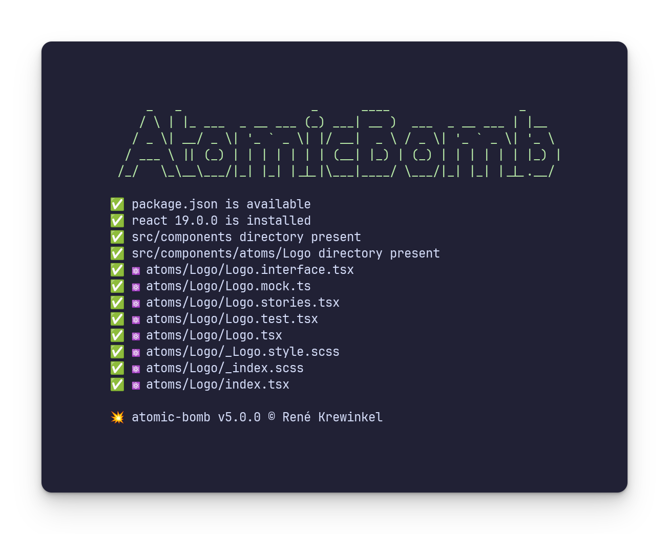
It will generate the boilerplate code for the component, including the SCSS file, Storybook stories and a basic unit test file and a mock file for use with the tests and Storybook

Atomic Bomb

Once configured, you can use the atomic-bomb command to create components.

It will generate the boilerplate code for the component, including the SCSS file, Storybook stories and a basic unit test file and a mock file for use with the tests and Storybook

Using Atomic Bomb

Once you've set up the platform, Use the following command to create a new component:

1npx atomic-bomb@latest --type <type> --name <name>

Where type is one of: atom, molecule, organism, page or template

and name is the name of the component you want to create.
The component will be created in the src/components/<type>/<component name> folder.

Naming conventions are important, so atomic bomb use Pascal Casing to correctly name the components and the files. To match the react requirements, atomic bomb automatically converts button to Button ,If you need something like ButtonGroup use following syntax:

1npx atomic-bomb@latest --type molecule --name "Button Group"

This will create a folder ..../molecules/ButtonGroup with the following content:

1ButtonGroup/ 2├── ButtonGroup.interface.tsx 3├── ButtonGroup.mock.ts 4├── ButtonGroup.stories.tsx 5├── ButtonGroup.test.tsx 6├── ButtonGroup.tsx 7├── _ButtonGroup.style.scss 8├── _index.scss 9└── index.tsx

The ButtonGroup.tsx file contains the component itself, the ButtonGroup.interface.tsx file contains the TypeScript interface for the component, the ButtonGroup.stories.tsx file contains the Storybook stories for the component, the ButtonGroup.test.tsx file contains the unit tests for the component, the ButtonGroup.mock.ts file contains the mock data for the component and the _ButtonGroup.style.scss file contains the SCSS code for the component.
The _index.scss file is used to include all components in a single file. This is used to include all components in the main.scss file.The index.ts file is used to export the component

In the parent directory, the index.ts file is used to export all components in the folder - the same applies to _index.scss

You can include this component in your project by importing it in the index.ts file of the molecules folder.:

1import { ButtonGroup } from '../../molecules/'

The code for ButtonGroup.tsx looks like this:

1// import { useState, useEffect, useContext } from 'react' 2import { ButtonGroupInterface } from './ButtonGroup.interface' 3 4/// TODO: update interface/arguments for ButtonGroup 5const ButtonGroup = ({testID, style, type, size, props }:ButtonGroupInterface) => { 6 7 return( 8 <div data-testid={ testID } 9 data-object-type={ type ?? ""} 10 className={ `ButtonGroup` }> 11 </div> 12 ) 13 14} 15 16export default ButtonGroup

multiple components

Creating multiple components at once is also possible, Make sure there are no spaces between the names.

1npx atomic-bomb --type atom --name "Label","Input Field","Button","Logo"

removing a component

Just remove the directory of the component you want to remove.And make sure you remove the component from the index.ts|js and _index.css file one level up.

Rust / Yew.rs
Rust / Yew.rs
porting to rust

I'm currently working on a Rust version of Atomic Bomb. It will be based on the Yew.rs framework. This will be a complete rewrite of the tool, but I'm trying to keep the same principles and structure.

Please check out my other rust based tool: Idea.cli

Atomic Design

The Rust version will be based on the same principles as the React version. It will be a CLI tool that creates boilerplate code for individual front-end components. The components will be based on the Atomic Design principles and will be easily customizable and reusable.

1use crate::model::category::Category; 2 3fn main() { 4 5 let _ = app::ensure_config_exists(); 6 let config = app::read_config_file().expect("Failed to read config file"); 7 let target_dir = generic::hash_string("atomic-rust-template"); 8 9 logo::show(&config); 10 11 if let Err(e) = repo::clone(&config.repo_url, target_dir.as_str()) { 12 eprintln!("Error: {}", e) 13 } 14 15 atomic::dirs::create_atomic_dirs().expect("TODO: panic message"); 16 17 let (category, name) = parse::parse_args(&config); 18 match category { 19 Category::Library => {} 20 Category::Setup => { 21 println!("Handling Setup"); 22 } 23 24 Category::Atom => { 25 println!("Handling Atom level with name: {}", name); 26 // Add specific logic for Atom here 27 } 28 Category::Molecule => { 29 println!("Handling Molecule level with name: {}", name); 30 // Add specific logic for Molecule here 31 } 32 Category::Organism => { 33 println!("Handling Organism level with name: {}", name); 34 // Add specific logic for Organism here 35 } 36 Category::Pages => { 37 println!("Handling Pages level with name: {}", name); 38 // Add specific logic for Pages here 39 } 40 Category::Templates => { 41 println!("Handling Templates level with name: {}", name); 42 // Add specific logic for Templates here 43 } 44 45 } 46}
porting to rust

I'm currently working on a Rust version of Atomic Bomb. It will be based on the Yew.rs framework. This will be a complete rewrite of the tool, but I'm trying to keep the same principles and structure.

Please check out my other rust based tool: Idea.cli